Key Points
- A correlation heatmap is a plot displaying the correlation coefficients between variables in a data frame.
- A correlation heatmap can help you explore the relationships between variables, identify potential patterns, and find outliers.
- You must use the ggplot2 package and the mtcars data set to create a correlation heatmap in R.
- You need to calculate the correlation matrix using the cor() function, reshape it into a long format using the melt() function, create a basic heatmap using the ggplot() and geom_tile() functions, add text labels using the geom_text() function, adjust the color scale using the scale_fill_gradient2() function, remove the upper triangle using the subset() argument, remove the background, grid lines, and axis titles using the theme() function, and add a title and a caption using the ggtitle() and labs() functions.
Hi, I'm Zubair Goraya, a Certified data analyst and a writer for Data Analysis, a website that provides tutorials related to RStudio. In this article, I will show you how to create a correlation heatmap in R, a powerful and popular data analysis and visualization programming language.
Creating Correlation Heatmaps in R : ggplot2 and Beyond
A correlation heatmap in R is a plot displaying the correlation coefficients between variables in a data frame. It is useful for exploring the relationships between variables, identifying potential patterns, and finding outliers. A correlation heatmap can also help you select the most relevant variables for your analysis and avoid multicollinearity problems.
In this article, I will use the ggplot2 package, one of the most widely used packages for data visualization in R. I will also use the mtcars data set, which contains information about 32 cars from a 1974 Motor Trend magazine.
By the end of this article, you can create a beautiful and informative correlation heatmap for your own data set.
What is a correlation coefficient?
A correlation coefficient is a numerical measure of the strength and direction of the linear relationship between two variables. It ranges from -1 to 1, where -1 indicates a perfect negative correlation, 0 shows no correlation, and 1 indicates a perfect positive correlation.
A correlation coefficient can be calculated using different methods, such as Pearson's r, Spearman's rho, or Kendall's tau.
In this article, I will use Pearson's r, the most common method for continuous variables. Pearson's r is defined as:
What is a correlation matrix?
A correlation matrix is a square matrix containing the correlation coefficients between all variables in a data frame. It has the same number of rows and columns as the number of variables and 1s on the main diagonal.
A correlation matrix can be symmetric or asymmetric, depending on whether the Order of the variables matters or not.
For example, here is a correlation matrix for the mtcars data set:
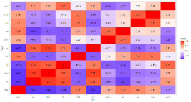
As you can see, the correlation matrix shows the correlation coefficients between all pairs of variables in the mtcars data set. For example, the coefficient between mpg and cyl is -0.85, indicating a strong negative correlation between miles per gallon and the number of cylinders.
How to create a correlation heatmap in R?
Load the ggplot2 package and the mtcars data set.
# Load ggplot2 package and mtcars data set
library(ggplot2)
data(mtcars)
head(mtcars,5)
Calculate the correlation matrix for the mtcars data set using the cor() function.
# Calculate correlation matrix
cor_mat <- cor(mtcars)
round(cor_mat,3)

Reshape the correlation matrix into a long format using the melt() function from the reshape2 package.
# Reshape the correlation matrix into a long format
library(reshape2)
melted <- melt(cor_mat)
Create a basic heatmap using the ggplot() function and the geom_tile() function, mapping the x and y variables to var1 and var2 and the fill variable to value.
# Create basic heatmap
ggplot(data = melted, aes(x = Var1, y = Var2, fill = value)) +
  geom_tile()
Text labels in the heatmap
# Add text labels
ggplot(data = melted, aes(x = Var1, y = Var2, fill = value)) +
  geom_tile() +
  geom_text(aes(Var2, Var1, label = round(value, 2)))
Adjust the color scale
# Adjust the color scale
ggplot(data = melted, aes(x = Var1, y = Var2, fill = value)) +
  geom_tile() +
  geom_text(aes(Var2, Var1, label = round(value, 2))) +
  scale_fill_gradient2(low = "blue", high = "red")
Remove the upper triangle.
library(dplyr)
# Filter the data to remove the upper triangle
filtered_data <- melted %>%mutate_if(is.factor, as.numeric) %>%
  filter(Var2 > Var1)
# Create the plot
ggplot(data = filtered_data, aes(x = Var1, y = Var2, fill = value)) +
  geom_tile() +
  geom_text(aes(label = round(value, 2))) +
  scale_fill_gradient2(low = "blue", high = "red"))
Remove the upper triangle
library(dplyr)
# Filter the data to remove the upper triangle
filtered_data <- melted %>%mutate_if(is.factor, as.numeric) %>%
  filter(Var2 < Var1)
# Create the plot
ggplot(data = filtered_data, aes(x = Var1, y = Var2, fill = value)) +
  geom_tile() +
  geom_text(aes(label = round(value, 2))) +
  scale_fill_gradient2(low = "blue", high = "red")+
  labs(caption = "Created by rstudiodatalab.com")
Heatmap Customization
Remove the background, grid lines
# Remove background, grid lines, and axis titles
ggplot(data = filtered_data, aes(x = Var1, y = Var2, fill = value)) +
  geom_tile() +
  geom_text(aes(label = round(value, 2))) +
  scale_fill_gradient2(low = "blue", high = "red")+
  labs(caption = "Created by rstudiodatalab.com")+
  theme(panel.background = element_blank(),
        panel.grid = element_blank(),
        axis.title.x = element_blank(),
        axis.title.y = element_blank())
Add a title and a caption.
Add a title and a caption to your plot using the ggtitle() and labs() functions.
# Add title and caption
ggplot(data = filtered_data, aes(x = Var1, y = Var2, fill = value)) +
  geom_tile() +
  geom_text(aes(label = round(value, 2))) +
  scale_fill_gradient2(low = "blue", high = "red")+
  theme(panel.background =element_blank(), panel.grid = element_blank(),
        axis.title.x = element_blank(),
        axis.title.y = element_blank()) +
  ggtitle("Correlation Heatmap for mtcars Data Set") +
  labs(caption = "Source: mtcars data set from ggplot2 package",
       subtitle = "Created by rstudiodatalab.com")
As you can see, the plot shows a correlation heatmap for the mtcars data set, with the lower triangle showing the correlation coefficients between pairs of variables. The color scale ranges from blue (low correlation) to red (high correlation), and the text labels show the rounded values of the coefficients. The plot has no background, grid lines, axis titles and a title and caption describing the data's source.
Pros and Cons
Some advantages of correlation heatmap in r are
- They provide more information than correlation matrices alone, showing the numerical values and the visual representation of the correlation coefficients.
- They can help you quickly identify the most and least correlated variables and any outliers or anomalies in your data.
- They can display multiple correlations on one plot, facilitating comparison and contrast.
Some disadvantages of correlation heatmap in r are
- They can be hard to read and interpret if too many variables or categories are on one axis, which may make your plot cluttered or confusing.
- They can be misleading if there are fewer observations in each variable or category, which may make your plot unreliable or inaccurate.
- They may need to be more familiar and intuitive to some audiences, who prefer more conventional plots such as scatter plots or bar charts.
When and Why
- You have a data frame with multiple continuous variables you want to explore or compare.
- You are interested in the linear relationships between your variables, not just their distributions.
- You want to visualize both the magnitude and direction of your correlation coefficients.
- You want to detect any outliers or anomalies in your data.
- You may not want to use correlation heatmaps when:
- You have too many variables or categories on one axis, which may make your plot more straightforward.
- More observations in each variable or category may make your plot reliable and accurate.
- You have an audience that is not familiar or comfortable with correlation heatmaps who may prefer more conventional plots such as scatter plots or bar charts.
Conclusion
I have shown you how to create a correlation heatmap in R using the ggplot2 package and the mtcars data set in this article. A correlation heatmap is a plot displaying the correlation coefficients between variables in a data frame. It helps explore the relationships between variables, identify potential patterns, and find outliers.
To create a correlation heatmap in R, you need to calculate the correlation matrix using the `cor()` function, reshape it into a long format using the `melt()` function, create a basic heatmap using the `ggplot()` and `geom_tile()` functions, add text labels using the `geom_text()` function, adjust the color scale using the `scale_fill_gradient2()` function, remove the upper triangle using the `subset()` argument, remove the background, grid lines, and axis titles using the `theme()` function, and add a title and a caption using the `ggtitle()` and `labs()` functions.
I hope you have enjoyed this article and learned something new. If you have any questions or feedback, please comment below. If you need help with your data analysis projects, contact me at contact@rstudiodatalab.com or hire me at Order Now.
Thank you for reading.
FAQs
What is a correlation coefficient?
A correlation coefficient is a numerical measure of the strength and direction of the linear relationship between two variables. It ranges from -1 to 1, where -1 indicates a perfect negative correlation, 0 shows no correlation, and 1 indicates a perfect positive correlation.
What is a correlation matrix?
A correlation matrix is a square matrix containing the correlation coefficients between all variables in a data frame. It has the same number of rows and columns as the number of variables and 1s on the main diagonal.
How to calculate a correlation matrix in R?
You can calculate a correlation matrix in R using the `cor()` function, which takes a data frame as an argument and returns a matrix of correlation coefficients.
How to reshape a correlation matrix into a long format in R?
You can reshape a correlation matrix into a long format in R using the `melt()` function from the reshape2 package, which takes a matrix as an argument and returns a data frame with three columns: Var1, Var2, and value.
How to create a basic heatmap in R?
You can create a basic heatmap in R using the `ggplot()` function and the `geom_tile()` function from the ggplot2 package, which makes a plot with tiles coloured according to a variable. It would help if you mapped the x and y variables to the columns of your data frame and the fill variable to the value of your correlation coefficient.
How to add text labels to a heatmap in R?
You can add text labels to a heatmap in R using the geom_text() function from the ggplot2 package, which adds text annotations to a plot. You need to map the x, y, and label variables to the columns of your data frame and optionally adjust your text's size, color, and position.
How to adjust the color scale of a heatmap in R?
You can adjust the color scale of a heatmap in R using the scale_fill_gradient2() function from the ggplot2 package, which creates a diverging color scale with two endpoints and a midpoint. You can specify the low, mid, and high colors, the midpoint value and the limits of your scale.
How can a plot's background, grid lines, and axis titles be removed in R?
You can remove a plot's background, grid lines, and axis titles in R using the theme() function from the ggplot2 package, which allows you to modify various plot elements. You can set these elements to element_blank() to make them invisible.
How to add a title and a caption to a plot in R?
You can add a title and a caption to a plot in R using the ggtitle() and labs() functions from the ggplot2 package, which allows you to add labels to your plot. You can specify the text for your title and caption and their size, color, and position.
Join Our Community Allow us to Assist You


![How to create a correlation heatmap in R [Update 2024]](https://blogger.googleusercontent.com/img/b/R29vZ2xl/AVvXsEhk84C6RDSZj8HndzPkdmXqTgJKvj2aY-v3BlUBS-9w7V7czIQzO4rOffMdsH_3WRd9x8Frepn_2S5-VnZWO_1nm7SbN_zyznHnkFESVa-15QwMVEMZ3HGxSNNJuo3AtAASb5GSoTOSW2ldmgMS16hdpPWiceabkHwmPCF4ECXXQcQ_E_g4U_mM46IJ9Ig/w200-h200-p-k-no-nu/How%20to%20create%20a%20correlation%20heatmap%20in%20R.webp)