
Table of Contents

Scatter Plot (geom_point)
ggplot(mtcars, aes(x = mpg, y = wt)) +geom_point(color = "darkblue", size = 3) +ggtitle("MPG vs Weight")
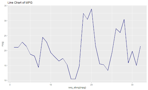
Line Chart (geom_line)
ggplot(mtcars, aes(x = seq_along(mpg), y = mpg)) +
  geom_line(color = "green", linewidth = 1) +
  ggtitle("Line Chart of MPG")

Bar Chart (geom_bar)
ggplot(mtcars, aes(x = factor(cyl))) +
  geom_bar(fill = "orange") +
  ggtitle("Cylinder Count Bar Chart")

Column Chart (geom_col)
ggplot(mtcars, aes(x = factor(cyl), y = mpg)) +
  geom_col(fill = "purple") +
  ggtitle("Average MPG by Cylinders")

Histogram (geom_histogram)
ggplot(mtcars, aes(x = mpg)) +
  geom_histogram(bins = 10, fill = "seagreen", color = "black") +
  ggtitle("MPG Distribution")

Density Plot (geom_density)
ggplot(mtcars, aes(x = mpg)) +
  geom_density(fill = "blue", alpha = 0.5) +
  ggtitle("MPG Density Plot")

Box Plot (geom_boxplot)
ggplot(mtcars, aes(x = factor(cyl), y = mpg)) +
  geom_boxplot(fill = "seagreen") +
  ggtitle("MPG by Cylinders")

Violin Plot (geom_violin)
ggplot(mtcars, aes(x = factor(cyl), y = mpg)) +
  geom_violin(fill = "pink") +
  ggtitle("MPG Violin Plot")
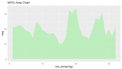
Area Chart (geom_area)
ggplot(mtcars, aes(x = seq_along(mpg), y = mpg)) +
  geom_area(fill = "lightgreen", alpha = 0.5) +
  ggtitle("MPG Area Chart")

Stacked Area Chart (geom_area)
ggplot(mtcars, aes(x = seq_along(mpg), y = mpg, fill = factor(cyl))) +
  geom_area(position = "stack") +
  ggtitle("Stacked MPG by Cylinders")

Stacked Bar Chart (geom_bar + position="stack")
ggplot(mtcars, aes(x = factor(cyl), fill = factor(gear))) +
  geom_bar(position = "stack") +
  ggtitle("Stacked Bar: Cylinders by Gear")

Grouped Bar Chart (geom_bar + position="dodge")
ggplot(mtcars, aes(x = factor(cyl), fill = factor(gear))) +
  geom_bar(position = "dodge") +
  ggtitle("Grouped Bar: Cylinders by Gear")

Dot Plot (geom_dotplot)
ggplot(mtcars, aes(x = mpg)) +
  geom_dotplot(binwidth = 1, fill = "darkgreen") +
  ggtitle("Dot Plot of MPG")
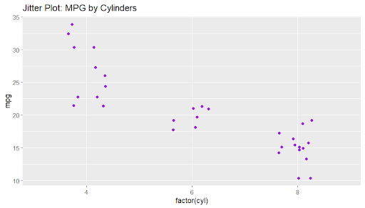
Jitter Plot (geom_jitter)
ggplot(mtcars, aes(x = factor(cyl), y = mpg)) +
  geom_jitter(width = 0.2, color = "purple") +
  ggtitle("Jitter Plot: MPG by Cylinders")

Bubble Chart (geom_point with size)
ggplot(mtcars, aes(x = wt, y = mpg, size = hp)) +
  geom_point(alpha = 0.7, color = "darkred") +
  scale_size(range = c(2, 10)) +
  ggtitle("Bubble: Weight vs MPG by HP")

Heatmap (geom_tile)
library(dplyr)
mtcars %>%
  group_by(cyl, gear) %>%
  summarise(mean_mpg = mean(mpg)) %>%
  ggplot(aes(x = factor(cyl), y = factor(gear), fill = mean_mpg)) +
  geom_tile() +
  scale_fill_gradient(low = "white", high = "blue") +
  ggtitle("Heatmap: Mean MPG by Cyl & Gear")
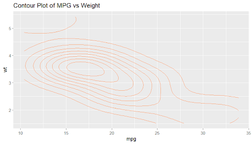
Contour Plot (geom_contour)
ggplot(mtcars, aes(x = mpg, y = wt)) +
  geom_density_2d(color = "darkorange") +
  ggtitle("Contour Plot of MPG vs Weight")

2D Density Plot (geom_density2d)
ggplot(mtcars, aes(x = mpg, y = wt)) +
  geom_density_2d_filled(alpha = 0.7) +
  ggtitle("2D Density Plot of MPG vs Weight")

Pie Chart (geom_bar + coord_polar)
ggplot(mtcars, aes(x = "", fill = factor(cyl))) +
  geom_bar(width = 1) +
  coord_polar(theta = "y") +
  theme_void() +
  ggtitle("Pie Chart of Cylinders")

Donut Chart (geom_bar + coord_polar)
ggplot(mtcars, aes(x = 2, fill = factor(cyl))) +
  geom_bar(width = 1) +
  coord_polar(theta = "y") +
  xlim(0.5, 2.5) +
  theme_void() +
  ggtitle("Donut Chart of Cylinders")

Polar Area Chart (coord_polar)
ggplot(mtcars, aes(x = factor(cyl), fill = factor(cyl))) +
  geom_bar(width = 1) +
  coord_polar() +
  theme_void() +
  ggtitle("Polar Area: Cylinders")

Radar Chart (coord_polar + geom_line)
library(dplyr)
mtcars %>%
  group_by(cyl) %>%
  summarise(mpg = mean(mpg)) %>%
  ggplot(aes(x = factor(cyl), y = mpg, group = 1)) +
  geom_line(color = "blue") +
  coord_polar() +
  ggtitle("Radar Chart: Avg MPG by Cyl")

Error Bar Plot (geom_errorbar)
library(dplyr)
mtcars %>%
  group_by(cyl) %>%
  summarise(mean_mpg = mean(mpg), sd_mpg = sd(mpg)) %>%
  ggplot(aes(x = factor(cyl), y = mean_mpg)) +
  geom_col(fill = "skyblue") +
  geom_errorbar(aes(ymin = mean_mpg - sd_mpg, ymax = mean_mpg + sd_mpg), width = 0.2) +
  ggtitle("Error Bars: MPG by Cyl")

Crossbar Plot (geom_crossbar)
library(dplyr)
        mtcars %>%
  group_by(cyl) %>%
  summarise(mean_mpg = mean(mpg), sd_mpg = sd(mpg)) %>%
  ggplot(aes(x = factor(cyl), y = mean_mpg)) +
  geom_crossbar(aes(ymin = mean_mpg - sd_mpg, ymax = mean_mpg + sd_mpg),
                fill = "orange") +
  ggtitle("Crossbar: MPG by Cyl")

Point Range Plot (geom_pointrange)
library(dplyr)
        mtcars %>%
  group_by(cyl) %>%
  summarise(mean_mpg = mean(mpg), sd_mpg = sd(mpg)) %>%
  ggplot(aes(x = factor(cyl), y = mean_mpg)) +
  geom_pointrange(aes(ymin = mean_mpg - sd_mpg, ymax = mean_mpg + sd_mpg),
                  color = "darkred") +
  ggtitle("Point Range: MPG by Cyl")

Linerange Plot (geom_linerange)
library(dplyr)
        mtcars %>%
  group_by(cyl) %>%
  summarise(ymin = min(mpg), ymax = max(mpg)) %>%
  ggplot(aes(x = factor(cyl))) +
  geom_linerange(aes(ymin = ymin, ymax = ymax), size = 1.5, color = "purple") +
  ggtitle("Linerange: MPG Range by Cyl")

Ribbon Plot (geom_ribbon)
ggplot(mtcars, aes(x = wt, y = mpg)) +
  geom_point() +
  geom_smooth(method = "lm", se = FALSE) +
  geom_ribbon(aes(ymin = predict(lm(mpg ~ wt)) - 5,
                  ymax = predict(lm(mpg ~ wt)) + 5),
              alpha = 0.2, fill = "blue") +
  ggtitle("Ribbon: Confidence Band")

Smooth Line Plot (geom_smooth)
ggplot(mtcars, aes(x = wt, y = mpg)) +
  geom_point() +
  geom_smooth(method = "loess", color = "red", se = FALSE) +
  ggtitle("Smooth Line: Weight vs MPG")

Quantile Regression (geom_quantile)
ggplot(mtcars, aes(x = wt, y = mpg)) +
  geom_point() +
  geom_quantile(quantiles = c(0.25, 0.5, 0.75), color = "darkgreen") +
  ggtitle("Quantile Regression Lines")
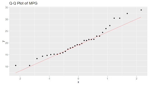
Q-Q Plot (geom_qq)
ggplot(mtcars, aes(sample = mpg)) +
  geom_qq(distribution = qnorm) +
  geom_qq_line(color = "red") +
  ggtitle("Q-Q Plot of MPG")

Rug Plot (geom_rug)
ggplot(mtcars, aes(x = mpg, y = wt)) +
  geom_point() +
  geom_rug(sides = "bl", color = "red") +
  ggtitle("MPG vs Weight with Rug Marks")

Text Label Plot (geom_text)
ggplot(mtcars, aes(x = wt, y = mpg)) +
  geom_point() +
  geom_text(aes(label = car), check_overlap = TRUE, size = 3, vjust = -1) +
  ggtitle("Car Labels on Weight vs MPG")

Label Plot (geom_label)
ggplot(mtcars, aes(x = wt, y = mpg)) +
  geom_point() +
  geom_label(aes(label = cyl), fill = "yellow", alpha = 0.5) +
  ggtitle("Cylinder Labels on Weight vs MPG")

Choropleth Map (geom_tile)
# Using cyl as "regions"
ggplot(mtcars, aes(x = factor(cyl), y = 1, fill = mpg)) +
  geom_tile() +
  scale_fill_gradient(low = "white", high = "blue") +
  theme_void() +
  ggtitle("Pseudo-Choropleth (Cyl as Regions)")

Hexagonal Binning (geom_hex)
ggplot(mtcars, aes(x = wt, y = mpg)) +
  geom_hex(bins = 10) +
  scale_fill_gradient(low = "lightblue", high = "darkblue") +
  ggtitle("Hex Binning: Weight vs MPG")

2D Bin Plot (geom_bin2d)
ggplot(mtcars, aes(x = wt, y = mpg)) +
  geom_bin2d(bins = 8) +
  scale_fill_gradient(low = "lightgreen", high = "darkgreen") +
  ggtitle("2D Binning: Weight vs MPG")

Count Overlap (geom_count)
ggplot(mtcars, aes(x = wt, y = mpg)) +
  geom_count(color = "purple") +
  ggtitle("Overlap Counts: Weight vs MPG")

Segment Plot (geom_segment)
ggplot(mtcars) +
  geom_segment(aes(x = wt, y = mpg, xend = mean(wt), yend = mean(mpg)),
               color = "gray") +
  geom_point(aes(x = wt, y = mpg), color = "red") +
  ggtitle("Segments to Mean")

Curve Plot (geom_curve)
ggplot(mtcars) +
  geom_curve(aes(x = min(wt), y = min(mpg),
                 xend = max(wt), yend = max(mpg)),
             curvature = 0.3, color = "blue") +
  xlim(1, 6) + ylim(10, 35) +
  ggtitle("Curve from Min to Max")

Step Plot (geom_step)
ggplot(mtcars, aes(x = seq_along(mpg), y = sort(mpg))) +
  geom_step(color = "darkgreen") +
  ggtitle("Step Plot of Sorted MPG")
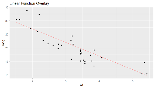
Function Plot (geom_function)
ggplot(mtcars, aes(x = wt)) +
  geom_point(aes(y = mpg)) +
  geom_function(fun = function(x) 37 - 5*x, color = "red") +
  ggtitle("Linear Function Overlay")

ECDF Plot (stat_ecdf)
ggplot(mtcars, aes(x = mpg)) +
  stat_ecdf(geom = "step", color = "purple") +
  ggtitle("ECDF of MPG")

Path Plot (geom_path)
ggplot(mtcars, aes(x = wt, y = mpg)) +
  geom_path(color = "orange") +
  ggtitle("Path Plot: Weight vs MPG")

Polygon Plot (geom_polygon)
library(dplyr)
mtcars %>%
  arrange(wt) %>%
  ggplot(aes(x = wt, y = mpg)) +
  geom_polygon(fill = "lightblue", alpha = 0.5) +
  ggtitle("Polygon: Weight vs MPG")

Reference Line (geom_hline)
ggplot(mtcars, aes(x = wt, y = mpg)) +
  geom_point() +
  geom_hline(yintercept = mean(mtcars$mpg), color = "red") +
  geom_vline(xintercept = mean(mtcars$wt), color = "blue") +
  ggtitle("Reference Lines at Means")
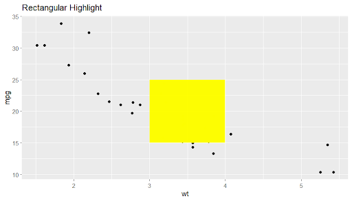
Rectangular Annotation (geom_rect)
ggplot(mtcars, aes(x = wt, y = mpg)) +
  geom_point() +
  geom_rect(aes(xmin = 3, xmax = 4, ymin = 15, ymax = 25),
            fill = "yellow", alpha = 0.2) +
  ggtitle("Rectangular Highlight")
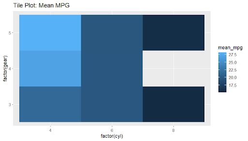
Tile Plot (geom_tile)
library(dplyr)
        mtcars %>%
  group_by(cyl, gear) %>%
  summarise(mean_mpg = mean(mpg)) %>%
  ggplot(aes(x = factor(cyl), y = factor(gear), fill = mean_mpg)) +
  geom_tile() +
  ggtitle("Tile Plot: Mean MPG")

Cleveland Dot Plot
ggplot(mtcars, aes(x = mpg, y = reorder(rownames(mtcars), mpg))) +
  geom_point(color = "darkred") +
  labs(y = "Car") +
  ggtitle("Cleveland Dot Plot")

Mosaic Plot (geom_rect)
library(dplyr)
mtcars %>%
  count(cyl, gear) %>%
  group_by(cyl) %>%
  mutate(xmax = cumsum(n)/sum(n), xmin = lag(xmax, default = 0)) %>%
  ggplot() +
  geom_rect(aes(xmin = xmin, xmax = xmax, ymin = as.numeric(cyl)-0.4,
                ymax = as.numeric(cyl)+0.4, fill = factor(gear))) +
  scale_y_continuous(breaks = unique(mtcars$cyl)) +
  ggtitle("Mosaic: Cyl vs Gear")

Treemap (geom_tile)
library(treemapify)
mtcars %>%
  group_by(cyl, gear) %>%
  summarise(size = n()) %>%
  ggplot(aes(area = size, fill = factor(cyl), subgroup = gear)) +
  geom_treemap() +
  geom_treemap_subgroup_border() +
  ggtitle("Treemap: Cyl and Gear")
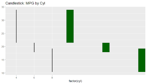
Candlestick Plot
mtcars %>%
  group_by(cyl) %>%
  summarise(open = min(mpg), high = max(mpg), low = min(mpg), close = max(mpg)) %>%
  ggplot(aes(x = factor(cyl))) +
  geom_linerange(aes(ymin = low, ymax = high), size = 1) +
  geom_rect(aes(ymin = open, ymax = close, xmin = as.numeric(cyl)-0.2,
                xmax = as.numeric(cyl)+0.2), fill = "darkgreen") +
  ggtitle("Candlestick: MPG by Cyl")

Marginal Plot
library(ggExtra)
p - ggplot(mtcars, aes(x = wt, y = mpg)) +
  geom_point()
ggMarginal(p, type = "histogram")

Streamgraph
library(ggstream)
mtcars %>%
  mutate(idx = seq_along(mpg)) %>%
  ggplot(aes(x = idx, y = mpg, fill = factor(cyl))) +
  geom_stream() +
  ggtitle("Streamgraph of MPG")

Dot Matrix Plot
ggplot(mtcars, aes(x = factor(cyl), y = factor(gear))) +
  geom_point(position = position_jitter(width = 0.2, height = 0.2),
             size = 3, alpha = 0.7) +
  ggtitle("Dot Matrix: Cyl vs Gear")
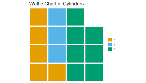
Waffle Chart
library(waffle)

waffle(cyl_counts/2, rows = 4, colors = c("#E69F00", "#56B4E9", "#009E73")) +
  ggtitle("Waffle Chart of Cylinders")
