KeyPoints
- scale_fill_gradient2 is a function in the ggplot2 package that creates a diverging color gradient for fill aesthetics.
- fill aesthetic is an aesthetic that controls the color of the interior of a geometric object, such as a bar, a point, or a polygon.
- diverging color gradient is a color gradient with three colors: one for low values, one for high values, and one for middle values. The colors usually diverge from the middle value, often white or gray.
- scale_fill_gradient2 has several arguments that can customise the colors, midpoint, space, and gradient guide, such as low, high, mid, midpoint, space, na.value, guide, and aesthetics.
- scale_fill_gradient2 can be applied to different types of plots, such as bar charts, histograms, and scatter plots, by using different geoms and aesthetics, such as geom_bar, geom_histogram, geom_point, x, y, and fill.
- scale_fill_gradient2 can be used with other aesthetics, such as alpha, size, and shape, to add more dimensions and information to the plots by using the alpha, size, and shape arguments of the geom functions.
- scale_fill_gradient2 can be used with other scales, such as scale_x_continuous, scale_y_continuous, and scale_color_gradient2, to modify the appearance and behaviour of the x, y, and color aesthetics, respectively, by using different arguments of the scale functions, such as limits, breaks, labels, trans, and guide.
- scale_fill_gradient2 can be used with other themes, such as theme_minimal, theme_bw, and theme_classic, to modify the overall appearance of the plot, such as the background, grid lines, axis lines, fonts, and colors, by using the theme functions and the theme function.
List of Function
| Function | Description |
|---|---|
| scale_fill_gradient2 | Creates a diverging color gradient for fill aesthetics |
| ggplot | Creates a ggplot object that defines the data and the mapping of the aesthetics |
| geom_tile | Creates a tile plot using rectangular tiles of different colors |
| geom_bar | Creates a bar chart using rectangular bars of different colors |
| geom_histogram | Creates a histogram using rectangular bars of different colors |
| geom_point | Creates a scatter plot using points of different colors |
| scale_x_continuous | Modifies the appearance and behavior of the x aesthetic |
| scale_y_continuous | Modifies the appearance and behavior of the y aesthetic |
| scale_color_gradient2 | Creates a diverging color gradient for color aesthetics |
| theme_minimal | Modifies the appearance of the plot to make it minimal and elegant |
| theme_bw | Modifies the appearance of the plot to make it black and white |
| theme_classic | Modifies the appearance of the plot to make it classic and simple |
| theme | Modifies the elements of the plot, such as the legend, the axis, the title, etc. |
Table of Contents
Hi, I am Zubair Goraya, a PhD scholar, a certified data analyst, and a freelancer with five years of experience. I am passionate about data analysis and visualisation and love sharing my knowledge and experience. I am also a contributor to the Data Analysis website, which is a data analysis website that provides tutorials related to RStudio. You can also join our rstudio workshop.
I am writting this article because I faced many difficulties in data visulaization during my PhD thesis writing about scale_fill_gradient2. I realized that scale_fill_gradient2 is a powerful and versatile function that can help you create beautiful and informative plots with different colors for different variable values.
However, it needs to be more well documented and explained in the existing resources. Therefore, I decided to write an article to help my fellow researchers who want to learn how to use scale_fill_gradient2 in R. I hope you will find this article useful and interesting.
Using scale_fill_gradient2 in R for Powerful Color Gradients
Have you ever wanted to create a plot that shows the variation of a variable across different categories or ranges but with different colors for different values? For example, maybe you want to show how the happiness index varies across different countries, but with red for low, white for medium, and blue for high values.
Or you could show how the distribution of continuous variables changes across different groups but with a gradient of colors from low to high. If you have, then you are not alone. I have faced this problem many times in my data analysis projects and have always struggled to find a simple and elegant way to do it in R. That is until I discovered the scale_fill_gradient2 function in the ggplot2 package.
scale_fill_gradient2 function allows us to create a diverging color gradient for our fill aesthetics, which means we can assign different colors to different variable values and control the midpoint, space, and guide of your gradient. In this tutorial, I will show you how to use this function in R to create stunning plots that will impress your audience and convey your message effectively.
How do you install and load the ggplot2 package in R?
ggplot2 is a popular and powerful package in R that allows you to create and customize various plots using a grammar of graphics. To use ggplot2, you need to install and load it in your R session. You can install ggplot2 from CRAN using the install.packages function:
install.packages(“ggplot2”)
You only need to install ggplot2 once unless you want to update it to the latest version. To load ggplot2, you need to use the library function:
library(ggplot2)
It would help if you loaded ggplot2 every time you start a new R session or whenever you want to use its functions. Once you have installed and loaded ggplot2, you can use scale_fill_gradient2 and other functions in the package to create beautiful plots.[
What is scale_fill_gradient2, and how does it work?
scale_fill_gradient2 is a function in the ggplot2 package that creates a diverging color gradient for fill aesthetics. A fill aesthetic is an aesthetic that controls the colour of the interior of a geometric object, such as a bar, a point, or a polygon. A diverging color gradient is a color gradient that has three colours: one for low values, one for high values, and one for middle values. The colours usually diverge from the middle value, often white or grey. The syntax of scale_fill_gradient2 is:
library(ggplot2)
?scale_fill_gradient2
#scale_fill_gradient2(low, high, mid, midpoint, space, na.value, guide, aesthetics)
where:
- Low is the colour for the lowest value of the variable. The default is “#132B43”.
- High is the colour for the highest value of the variable. The default is “#56B1F7”.
- Mid is the colour for the middle value of the variable. The default is “white”.
- The midpoint is the variable's value corresponding to the middle colour. The default is 0.
- Space is the colour space in which to calculate the gradient. The colour space can be RGB, HSV, HCL, or Lab.
- The Lab colour space usually produces the best perceptual properties but is slower than the others. The default is “Lab”.
- na.value is the colour for missing values. The default is “gray50”.
The guide is the type of legend to use for the gradient. The guide can be either a colorbar or a legend. A colorbar is a continuous colour scale, while a legend is a discrete colour scale. The default is “colorbar”.
aesthetics is a character vector that specifies which aesthetics to apply the scale to; the default is “fill”.
To use scale_fill_gradient2, you must have a ggplot object with a fill aesthetic mapped to a variable. Then, you can add scale_fill_gradient2 to the ggplot object to create the diverging color gradient. For example, suppose you have a data frame called df that contains two variables: x and y. You can create a basic plot with scale_fill_gradient2 as follows:
ggplot(mtcars, aes(x = mpg, y = hp, fill = (gear))) +
  geom_tile() + scale_fill_gradient2()
How do you create a basic plot with scale_fill_gradient2?
To create a basic plot with scale_fill_gradient2, you need to have a data frame that contains a variable that you want to map to the fill aesthetic. For this tutorial, I will use a data set called gapminder, which contains information about the life expectancy, GDP per capita, and population of 142 countries from 1952 to 2007. You can download this data set from here.
To load the gapminder data set, you can use these functions :
library(gapminder)
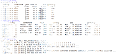
data("gapminder")head(gapminder) summary(gapminder) str(gapminder)
The output shows that the gapminder data frame has six variables: country, continent, year, lifeExp, gdpPercap, and pop.
The variables are different types: character, factor, integer, numeric, numeric, and integer, respectively.
To create a basic plot with scale_fill_gradient2, I will use the ggplot function to create a ggplot object and then add a geom_tile layer to create a tile plot.
A tile plot is a type of plot that shows the values of a variable using rectangular tiles of different colours. I will map the fill aesthetic to the lifeExp variable, which represents each country's life expectancy yearly.
I will also map the x and y aesthetics to the country and year variables, respectively, to show the variation in life expectancy across different countries and years. Then, I will add scale_fill_gradient2 to create a diverging color gradient for the fill aesthetic. The code is:
library(ggplot2)
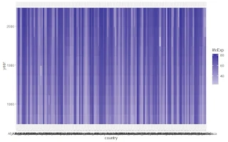
ggplot(gapminder, aes(x = country, y = year, fill = lifeExp)) + geom_tile() + scale_fill_gradient2()
The plot shows that the life expectancy of each country and year is represented by a tile of a colour corresponding to the value of the lifeExp variable.
The colour gradient ranges from dark blue for low values to white for medium values to light blue for high values.
The midpoint of the gradient is 0, which means that the middle color is assigned to the lowest value of the lifeExp variable. The colour space is Lab, which means that the gradient is calculated in the Lab colour space.
The guide is a color, which means that the legend is a continuous color scale that shows the mapping between the lifeExp variable's values and the gradient's colours.
Related Posts
How do you customize your gradient's colours, midpoint, space, and guide?
One of the advantages of scale_fill_gradient2 is that it allows you to customize the colours, midpoint, space, and guide of your gradient. You can use the function's parameters to change these aspects of your gradient according to your preferences and needs.
How do you customize the colours of your gradient?
To customize the colours of your gradient, you can use the low, high, and mid parameters of scale_fill_gradient2. You can specify the colours using any of the following methods:
- A name of a colour, such as “red”, “green”, or “blue”.
- A hexadecimal code of a color, such as “#FF0000”, “#00FF00”, or “#0000FF”.
- A numeric value between 0 and 1 represents the grey level of colour, such as 0 for black, 0.5 for grey, or 1 for white.
- A function that returns a vector of colors, such as rainbow, heat. colors, or topo.colors.
library(dplyr)
gapminder  %>% arrange(desc(lifeExp)) %>% top_n(100) %>%
  ggplot()+ aes(x = country, y = year, fill = lifeExp) + geom_tile() +
  scale_fill_gradient2(low = "red", high = "blue", mid = "white")+coord_flip()
The plot shows that the gradient's colours have changed to red, white, and blue. The low parameter controls the colour for the lowest value of the lifeExp variable, red.  The high parameter controls the colour for the highest value of the lifeExp variable, blue. The mid parameter controls the colour for the middle value of the lifeExp variable, which is white.
How do you customize the midpoint of your gradient?
For example, suppose you want to change the midpoint of your gradient to 50, which is the median value of the lifeExp variable. You can do so by using the following code:
gapminder  %>% arrange(desc(lifeExp)) %>% top_n(100) %>%
  ggplot()+ aes(x = country, y = year, fill = lifeExp) +
  geom_tile() +
  scale_fill_gradient2(midpoint = 50)+coord_flip()
The plot shows that the midpoint of the gradient has changed to 50. The midpoint parameter controls the value of the lifeExp variable that corresponds to the middle color of the gradient, which is white. The values below 50 are assigned to the low colour, dark blue. The values above 50 are assigned to the high colour light blue. The values equal to 50 are assigned to the mid colour, which is white.
How do you customize the space of your gradient?
To customize the space of your gradient, you can use the space parameter of scale_fill_gradient2. You can specify the space as a character string representing the colour space to calculate the gradient. The colour space can be RGB, HSV, HCL, or Lab. The default is Lab, meaning the gradient is calculated in the Lab colour space. The Lab colour space usually produces the best perceptual properties but is also slower than the others.
For example, suppose you want to change the space of your gradient to HSV, which is the hue, saturation, and value colour space. You can do so by using the following code:
gapminder  %>%
  arrange(desc(lifeExp)) %>%
  top_n(100) %>%
  ggplot() +
  aes(x = country, y = year, fill = lifeExp) +
  geom_tile() +
  scale_fill_gradientn(colors = viridisLite::viridis(100))+coord_flip()
The plot shows that the space of the gradient has changed to viridis(100). The space parameter controls the colour space in which to calculate the gradient. The colour space is based on the colours' hue, saturation, and value. The hue is the colour angle, ranging from 0 to 360 degrees. The saturation is the colour intensity, ranging from 0 to 100 per cent. The colour brightness value ranges from 0 to 100 per cent. The HSV colour space may produce different colour effects than the Lab colour space, depending on the colours and values of the variable.
How do you customise the guide of your gradient?
To customise the guide of your gradient, you can use the guide parameter of scale_fill_gradient2. You can specify the guide as either a character string or a function that represents the type of legend to use for the gradient. The guide can be either “colorbar” or “legend”. A colorbar is a continuous colour scale, while a legend is a discrete colour scale. The default is “colorbar”, meaning that the legend is a continuous color scale that shows the mapping between the variable's values and the gradient's colours.
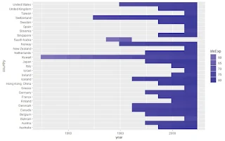 For example, suppose you want to change the guide of your gradient to a legend, which is a discrete colour scale.
You can do so by using the following code:
gapminder %>% arrange(desc(lifeExp)) %>% top_n(100) %>% ggplot() + aes(x = country, y = year, fill = lifeExp) +geom_tile() + scale_fill_gradient2(guide = "legend")+coord_flip()}
The plot shows that the guide of the gradient has changed to a legend. The guide parameter controls the type of legend to use for the gradient. A legend is a discrete colour scale that maps the variable's values and the gradient's colours.
The legend has several breaks, which are the values of the variable that are assigned to the colours of the gradient. The breaks are determined by the breaks argument of the guide function, which can be either a numeric vector or a function that returns a numeric vector.
The default is NULL, meaning the scale automatically calculates the breaks. The legend also has some labels: the text labels are displayed next to the breaks. The labels are determined by the labels argument of the guide function, which can be either a character vector, a numeric vector, or a function that returns a character vector. The default is NULL, meaning the labels are the same as the breaks.
How to apply scale_fill_gradient2 to different types of plots?
One of the benefits of scale_fill_gradient2 is that it can be applied to different types of plots, such as bar charts, histograms, and scatter plots. You can use different geoms and aesthetics to create different types of plots with scale_fill_gradient2.
A geom is a function in ggplot2 that defines the geometric object for the plot, such as geom_bar, geom_histogram, or geom_point. An aesthetic is a mapping between a variable and a visual property of the geometric object, such as x, y, fill, colour, size, or shape.
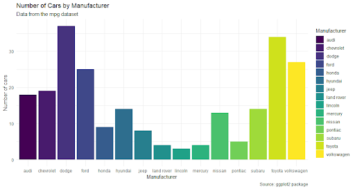
How do you apply scale_fill_gradient2 to a bar chart?
A bar chart is a type of plot showing a variable's frequency or proportion representing the categories or groups and the y aesthetic to the variable representing different categories or groups using rectangular bars.
To create a bar chart with scale_fill_gradient2, you can use the geom_bar function to create the bars and map the fill aesthetic to the variable that you want to show the variation of. You can also map the x aesthetic to the variable representing the categories or groups and the y aesthetic to the variable representing the frequency or proportion.
For example, you want to create a bar chart that shows the average life expectancy by continent in 2007. You can do so by using the following code:
gapminder %>%
  filter(year == 2007) %>%
  group_by(continent) %>% summarize(lifeExp=mean(lifeExp)) %>%
  ggplot() +
  aes(x = continent, y = lifeExp, fill = lifeExp) +
  geom_bar(stat = "identity") +
  scale_fill_gradient2()
The plot shows that the average life expectancy by continent in 2007 is represented by a colour bar corresponding to the value of the lifeExp variable.  The colour gradient ranges from dark blue for low values to white for medium values to light blue for high values.
The midpoint of the gradient is 0, which means that the lowest value of the lifeExp variable is assigned to the middle colour. The colour space is Lab, meaning the gradient is calculated in the Lab colour space. The guide is a colorbar, meaning that the legend is a continuous colour scale that shows the mapping between the lifeExp variable's values and the gradient's colours.
geom_bar function
The geom_bar function creates the bars and takes stat and fun arguments.
- The stat argument specifies the statistical transformation to use for the bars. The default is “count”, which means that the number of observations in each group determines the height of the bars.
- The fun argument specifies the summary function to use for the bars. The default is NULL, meaning the stat argument determines the summary function.


How to apply scale_fill_gradient2 to a histogram?
A histogram is a type of plot showing the distribution of a continuous variable using rectangular bars representing the frequency or density of values in different intervals or bins. To create a histogram with scale_fill_gradient2, you can use the geom_histogram function to create the bars and map the fill aesthetic to the variable you want to show the variation of.
You can also map the x aesthetic to the variable representing the values and the y aesthetic to the variable representing the frequency or density. For example, suppose you want to create a histogram that shows the distribution of life expectancy by continent in 2007. You can do so by using the following code:{
gapminder %>%
  filter(year == 2007) %>%
  group_by(continent) %>% summarize(lifeExp=mean(lifeExp)) %>%
    ggplot()+ aes(x = lifeExp, color = continent) + geom_histogram() + scale_fill_gradient2()
The plot shows that the distribution of life expectancy by continent in 2007 is represented by a histogram of bars of different colours corresponding to the values of the continent variable.  The colour gradient ranges from dark blue for low values to white for medium values to light blue for high values. The midpoint of the gradient colour is 0, which means that the lowest value of the continent variable is assigned to the middle color.
The colour space is Lab, which means that the gradient is calculated in the Lab colour space. The guide is a colorbar, meaning that the legend is a continuous colour scale that shows the mapping between the continent variable's values and the gradient's colours.
The geom_histogram function creates the histogram and takes two arguments: bins and binwidth.
- The bins argument specifies the number of bins for the histogram. The default is 30, which means that the histogram has 30 bins.
- The binwidth argument specifies the width of each bin. The default is NULL, which means that the binwidth is automatically calculated by the function. You can change the bins and binwidth arguments to adjust the appearance of the histogram.
How to apply scale_fill_gradient2 to a scatter plot?
A scatter plot is a type of plot that shows the relationship between two continuous variables using points that represent the values of the variables for each observation. To create a scatter plot with scale_fill_gradient2, you can use the geom_point function to create the points and map the fill aesthetic to the variable that you want to show the variation of.
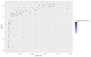
You can also map the x and y aesthetics to the variables that represent the values of the two continuous variables. For example, suppose you want to create a scatter plot that shows the relationship between life expectancy and GDP per capita by continent in 2007.
gapminder %>%
  filter(year == 2007) %>%
  group_by(continent,gdpPercap) %>% summarize(lifeExp=mean(lifeExp)) %>%
  ggplot()+ aes(x = gdpPercap, y = lifeExp, fill = as.numeric(continent)) +
  geom_point(shape = 21) + scale_fill_gradient2()
The plot shows that the relationship between life expectancy and GDP per capita by continent in 2007 is represented by a scatter plot of points of different colours that correspond to the values of the continent variable.
The colour gradient ranges from dark blue for low values to white for medium values to light blue for high values. The midpoint of the gradient is 0, which means that the lowest value of the continent variable is assigned to the middle colour.The colour space is Lab, which means that the gradient is calculated in the Lab colour space. The guide is a colorbar, which means that the legend is a continuous colour scale that shows the mapping between the values of the continent variable and the colours of the gradient.
The meaning that legend is a continuous colour scale that shows the mapping between the continent variable's values and the gradient's colours function creates the points and takes one argument: shape.
The shape argument specifies the shape of the points. The default is 19, which means that the points are solid circles. In this case, we use 21, meaning the points are circles with a border and a fill. It allows us to map the fill aesthetic to the continent variable and create a diverging colour gradient for the points. You can change the argument's shape to adjust the points' appearance.
Conclusion
In this article, we learn how to use the scale_fill_gradient2 function in R to create diverging colour gradients for your plots. You have learned the following points:
- scale_fill_gradient2 is a function in the ggplot2 package that creates a diverging color gradient for fill aesthetics, which controls the color of the interior of a geometric object, such as a bar, a point, or a polygon.
- scale_fill_gradient2 has several arguments that can customize the gradient's colors, midpoint, space, and guide, such as low, high, midpoint, space, na.value, guide, and aesthetics.
- scale_fill_gradient2 can be applied to different types of plots, such as bar charts, histograms, and scatter plots, by using different geoms and aesthetics, such as geom_bar, geom_histogram, geom_point, x, y, and fill.
- scale_fill_gradient2 can be used with other aesthetics, such as alpha, size, and shape, to add more dimensions and information to the plots by using the alpha, size, and shape arguments of the geom functions.
- scale_fill_gradient2 can be used with other scales, such as scale_x_continuous, scale_y_continuous, and scale_color_gradient2, to modify the appearance and behavior of the x, y, and color aesthetics, respectively, by using different arguments of the scale functions, such as limits, breaks, labels, trans, and guide.
- scale_fill_gradient2 can be used with other themes, such as theme_minimal, theme_bw, and theme_classic, to modify the overall appearance of the plot, such as the background, grid lines, axis lines, fonts, and colours, by using the theme functions and the theme function.
I hope you have enjoyed this tutorial and learned something new and useful. scale_fill_gradient2 is a powerful and versatile function that can help you create beautiful and informative plots with different colours for different variable values.
You can use scale_fill_gradient2 to explore and visualize your data and to communicate your findings and insights to your audience. You can also experiment with different parameters, geoms, aesthetics, scales, and themes to customize your plots and make them more appealing and expressive. If you have any questions or feedback, please comment below. And if you like this article, please share it with others and help us grow. Thank you for reading!
Frequently Asked Questions (FAQs)
How do you use scale_fill_gradient ggplot2 to create a sequential color gradient for your plots?
scale_fill_gradient is a function in the ggplot2 package that creates a sequential color gradient for fill aesthetics. A fill aesthetic is an aesthetic that controls the color of the interior of a geometric object, such as a bar, a point, or a polygon. A sequential color gradient is a color gradient that has two colors: one for low values and one for high values. The colors usually change smoothly from low to high.
The syntax of scale_fill_gradient is:
scale_fill_gradient(low, high, na.value, guide, aesthetics)
How to change the limits of the color gradient using scale_fill_gradient2 limits in R?
scale_fill_gradient2 limits is an argument of the scale_fill_gradient2 function that specifies the minimum and maximum values of the variable that are mapped to the colors of the gradient. The default is NULL, meaning the scale automatically calculates the limits. You can change the limits of the color gradient by setting the limits argument to a numeric vector of length two that represents the desired minimum and maximum values.
How to customize the labels of the color gradient using scale_fill_gradient2 labels in R?
scale_fill_gradient2 label is an argument of the scale_fill_gradient2 function that specifies the text labels displayed next to the tick marks on the color bar or the legend. The default is NULL, which means that the labels are the same as the breaks, which are the variable values mapped to the colors of the gradient. You can customize the labels of the color gradient by setting the labels argument to a character vector, a numeric vector, or a function that returns a character vector.
How to change the title of the legend using scale_fill_gradient2 legend title in R?
scale_fill_gradient2 legend title is an argument of the scale_fill_gradient2 function that specifies the title of the legend. The default is NULL, meaning that the title is the variable's name that is mapped to the fill aesthetic. You can change the legend title by setting the legend title argument to a character string representing the desired title.
Need a Customized solution for your data analysis projects? Are you interested in learning through Zoom? Hire me as your data analyst. I have five years of experience and a PhD. I can help you with data analysis projects and problems using R and other tools. To hire me, you can visit this link and fill out the order form. You can also contact me at info@rstudiodatalab.com for any questions or inquiries. I will be happy to work with you and provide you with high-quality data analysis services.


